Unfortunately, it seems if you ask ten authors how much research you should do for your story, you’ll likely get ten different answers.

Research? Who wants to do research?
Our answer? Simple. Enough to make your story credible and appealing.
One of the things we can assure you of: If you try and ‘wing it’ on story facts, some one will call you on it.
Some examples:
A recent book Bob read had the author placing her millionaire’s mansion in a white collar section of Brooklyn. The first two reviews posted called her on it. They then went on to lambast her for not knowing anything about Brooklyn, NY and not bothering to take the time to look the neighborhood up. From there, they launched into multiple issues with her story that could easily have been fixed with a little research. Both of them were further “insulted” for the author missing the beauty of their neighborhood and trying to make it into something it wasn’t.
Even the simplest of details will be caught.
In the second book of Bob’s trilogy, he had the fire department called out to deal with a car teetering on the side of a bridge. The fireman that the chief of our fire department had assigned to help me, called me on my description. “You had our primary engine busy on another call, so they brought out our backup engine and had them winch the car off the side of the bridge. The problem is, there is no winch on the front of our backup engine.” Ha! Who would ever have caught that? His wife! She was the one who read it over his shoulder and caught it right away.
Sometimes it’s not a case of being wrong, it’s a case of missed opportunity
An author whose work we edited simply described a park in London where her main characters met, as “beautiful”. When we read the scene, we remembered sitting in that park and how wonderful and relaxing it was; not to mention way beyond just beautiful, no matter what season. After double checking to make sure pictures on the internet reflected what we’d remembered, we directed her to the websites we’d found and suggested she “enhance” her description. We suggested she rewrite it so the reader wanted to catch a flight to London and go sit in the park.
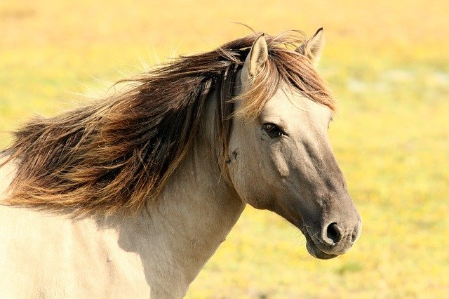
If your going to include an animal in your story you very well better learn all you can about it (them). Dog, cat and horse lovers the world over will nail you EVERY TIME if you get it wrong. Trust us, they are merciless: and excellent at writing seething reviews! Bob had one rip him apart because she said he didn’t know how much a dead horse’s head weighed (you have to read my story to understand) and that no girl could lift it to slide underneath. What she missed (because she couldn’t wait to nail me.) was that the horse was still alive when he lifted his head so Bob’s heroine could slide underneath. (HA! Take that horse lady reviewer!)
Scenes are almost as bad as animals.
If you describe real places, you better be accurate. Someone (or ones) live there and if you mess up what their house, street, town, county, state or country looks like, you’ll get called on it. But more often than not it’s a major “missed opportunity” you should be worried about. This is quite often why Robyn uses fictitous towns in her stories so she can play around with geography and the layout of a town, add shops and other things knowing she’ll not get torn to pieces as if it was a real place.
We can go on and on and on covering restaurants, menus, plane flights, airports, stations, train trips, cemeteries, cities, parks, Victorian houses, carriages, cars (Yip, know what a Ford Anglia looks like? We do!), boats, planes, … well we hope you get the idea. And, yes, we’ve written and or edited stories about all of these.
Which leads us to our next section:
Research is fun.
With today’s internet, it’s almost impossible to find something that Google, Bing or Wikipedia (usually all three) doesn’t have a dozen or so pages describing it. Everything from its rich history to dozens of pictures and answers to typical questions about it. These are ideal sources for creating enticing facts and descriptions that you can use to tell and spice up your story.
A word of caution though. Don’t fall into the old pendulum trap. That’s where you go from little to no description to way too much description. Keep it short and make sure the descriptions and facts add to your story line. Don’t just add fluff for the sake of adding things. For example, if you’re writing a mystery, the character will notice the shrubbery they can hide behind but will probably not notice or be interested in the beautiful flower beds.
If your main male character is taking his love interest out for dinner, look up the restaurant, or one you know and like. Use pictures of the outside, inside and their menu to help you describe the scene. The outside only if it helps describe her amazement as they pull up to it. The inside and menu to show how impressed she is. Again, it should fit with the scene you want to paint and, it must fit into the story line.
Taking her off to the rose garden will only distract the reader when she really wants to find the perfect plant to do away with her ex. So, find and head her for the poison garden. There are pretty plants there too that she can appreciate while she plans his demise.
Your research can also be used to develop your characters. Is she totally impressed that he took her to a fab place or perhaps she couldn’t care less: in which case she might be noticing the worn seats, the inattentive server and the bland food.
So, the message here is:

Stand Tall!
Use your research to find both good and bad things you can use to help fabricate or enhance your story and even describe your characters.
You will be amazed at how you can use scenery to help describe your characters. Is she only impressed by elaborate things and classy places or is she okay with a warm cosey café with good food?
Is he taking her to a fancy place or a dump to see how she reacts?
Does she only love roses or is she overwhelmed when she gets a single daisy?
Is she happy going out in a rowboat or is she a cabin cruiser type of girl?
In each of these cases, research fancy restaurants, warm cafes, dumpy eating places, roses, daisies, row boats or cabin cruisers to help you decide what to use.
In closing, the more research you do for your stories the easier it will become. You’ll also find yourself discovering new ways to make your stories and descriptions even better.
***
For your current work in progress or anticipated work, how much research have you done or plan to do? How much of what you learn will be used to just make you smart or actually appear in your work? Finally, were you able to enhance your character descriptions using your research?


